Bootstrap Buttons | Explained
This article will instruct you:
- How to Make Buttons in Bootstrap?
- How to Create Outline Buttons in Bootstrap?
- How to Adjust Bootstrap Button Sizes?
- How to Make a Block-Level Button in Bootstrap?
- How to Create Active State Buttons in Bootstrap?
- How to Create Disabled State Buttons in Bootstrap?
How to Make Buttons in Bootstrap?
The Bootstrap “btn” class is utilized to create buttons. To add styled buttons, you can use the “btn” class with the color class, such as “btn-success” to create a green button.
In HTML, the “<button>”, “<a>”, and “<input>” tags with the type “button” are utilized to create buttons. The “btn” class has predefined styling that add basic styling to the button elements.
For a clear concept, check out the example below.
Example
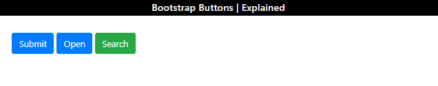
In the HTML file, follow the steps to create buttons using different tags:
- Add “<button>” and “<a>” elements and assign them “btn” and “btn-primary” classes.
- Then, add an “<input>” tag with the type “button”. Assign it the “btn” and “btn-success” for styling as first two buttons as blue, and the third one as green:
Output
How to Create Outline Buttons in Bootstrap?
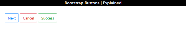
To add button outlines, the Bootstrap “btn-outline-*” class is used. In its syntax,“*” here represents the outline color. For instance, “btn-outline-danger” places the red outline, “btn-outline-primary” sets the blue outline, and more.
Analyze the code given below:
It can be observed that the “Next” button has a blue outline, the “Cancel” button with red outline, and the “Success” button has been styled with a green outline:
How to Adjust Bootstrap Button Sizes?
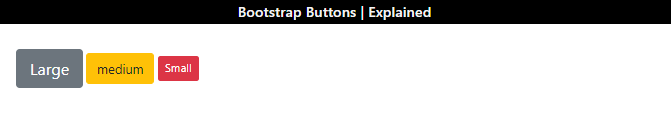
Some Bootstrap classes are applied to adjust the button sizes, such as:
- “btn-lg” class is applied to create a large button. This class can increase font size and padding.
- “btn-md” creates a medium-sized button.
- “btn-sm” creates a small button.
Example
Now, we will create three buttons with different sizes and self-explanatory names:
Output
How to Make a Block-Level Button in Bootstrap?
The block-level buttons are the ones that hold the full-width size. To create the block-level buttons, the “btn-block” class is utilized as follows
Output

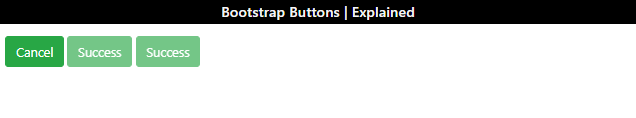
How to Create Active State Buttons in Bootstrap?
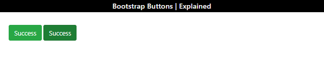
The active state buttons refer to the buttons that are currently active. These buttons are slightly darker than normal. To create such buttons, the Bootstrap “active” class is utilized.
Example
The below code creates two buttons. The first one is in the normal state while the other one is applied with the “active” class:
Output
How to Create Disabled State Buttons in Bootstrap?
The disabled state buttons refer to the buttons that are unclickable and unusable. In Bootstrap, the “disabled” class is utilized to create a disabled state button. The “disabled” attribute can also be used for this purpose.
Example
Check out the example provided below:
- The first button is not in a disabled state.
- The second one utilizes the “disabled” class to create a disabled state button.
- The third one uses the “disabled” attribute:
Output
We have covered different aspects related to Bootstrap buttons and their styling in CSS.
Conclusion
The “btn” class is utilized to create Bootstrap buttons with a simple design. To create colored and outline buttons, the “btn-*” and “btn-outline-*” classes are utilized where the “*” symbolizes any color class. For instance, “btn-warning” creates a yellow button, “btn-outline-warning” creates a yellow outlined button, and many more. To make the buttons active or disabled, the “active” and “disabled” classes are applied, respectively. This post provided a comprehensive guide on the Bootstrap buttons.
Source: linuxhint.com