Bar Plot Pandas
In the field of Data Science, the bar graph is one of the fundamental visualization techniques that helps to compare the different sets of data among different groups easily. Basically, it will show the relationship using two axes: one axis is categorical and one axis is numeric (discrete). In this guide, we will create a bar plot from the pandas DataFrame.
Topic of Contents
.
Bar plot can be visualized in two ways: horizontal and vertical. A vertical bar plot is created using pandas.DataFrame.plot.bar() function, while a horizontal bar plot is created using pandas.DataFrame.plot.barh() function. The parameters for these two functions are the same.
1. pandas.DataFrame.plot.bar
We can create a Vertical Bar Plot using the pandas.DataFrame.plot.bar function. Let’s see the syntax.
Syntax:
pandas.DataFrame.plot.bar(x, y, other arguments)
- x and y take the DataFrame columns. If x is not specified, the index of the DataFrame is used to plot and all the numeric columns are plotted if y is not specified.
- Apart from these, we can also pass other parameters like figsize (size of the barplot), rot (Barplot rotation view), stacked (Stacked bar plot) etc. All these are discussed as separate examples.
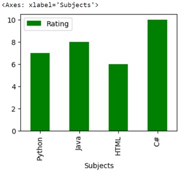
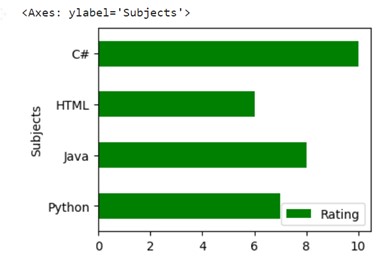
Example 1
Let’s create a DataFrame named subject_rating with three columns: ‘Category’, ‘Subjects’ and ‘Rating’. We will plot the Subjects on the x-asis and Rating on the y-axis in a Vertical Bar plot. The bars will be colored green (using the color parameter) and size of the bar plot will be set to (4,3) by passing the figsize parameter.
# Create DataFrame with two columns
subject_rating = pandas.DataFrame({‘Category’:[‘Data’, ‘Programming’, ‘Web’,‘Programming’],
‘Subjects’:[‘Python’, ‘Java’, ‘HTML’,‘C#’],
‘Rating’:[7,8,6,10]})
# Plot Subjects and Rating to a Vertical bar plot
subject_rating.plot.bar(x=‘Subjects’, y=‘Rating’,figsize=(4,3),color=‘green’)
Output
For each subject (Under X-axis) the rating is shown (Under Y-axis).
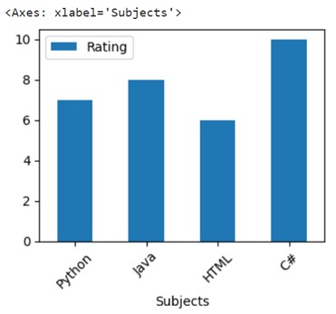
Example 2: Rotate the X-Labels by 45 Degrees
Let’s create a DataFrame – subject_rating with two columns: Subjects and Rating. We will plot x =Subjects and y = Rating columns to a Vertical Bar plot by rotating the X-axis to 45 degrees.
# Create DataFrame with two columns
subject_rating = pandas.DataFrame({‘Subjects’:[‘Python’, ‘Java’, ‘HTML’,‘C#’], ‘Rating’:[7,8,6,10]})
# Vertical bar plot with rotation=45.
subject_rating.plot.bar(x=‘Subjects’, y=‘Rating’,figsize=(4,3),rot=45)
Output
Both the columns are plotted and X-Labels are rotated to 45 degrees.
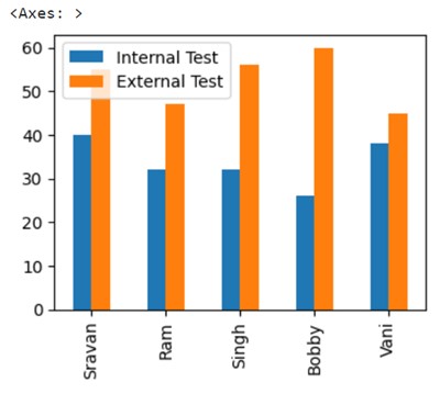
Example 3: Plot a Whole DataFrame to a Vertical Bar Plot
Let’s create a DataFrame – student_marks with two columns: ‘Internal Test’ and ‘External Test’ with five values each. Indices of these five values will be [‘Sravan’, ‘Ram’, ‘Singh’, ‘Bobby’, ‘Vani’]. Plot the entire DataFrame without specifying x and y parameters.
# Create DataFrame with two columns
student_marks = pandas.DataFrame({‘Internal Test’:[40,32,32,26,38], ‘External Test’:[55,47,56,60,45]}
,index=[‘Sravan’,‘Ram’,‘Singh’,‘Bobby’,‘Vani’])
# Plot a whole dataframe to a Vertical bar plot
student_marks.plot.bar(figsize=(4,3))
Output
You can see that both columns are included in the Vertical Bar plot with different colors by default.
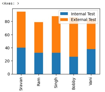
Example 4: Stacked Bar Plot
Utilize the same DataFrame as created under example 3 and create stacked bar plot by specifying the stacked parameter set to True.
# Create DataFrame with two columns
student_marks = pandas.DataFrame({‘Internal Test’:[40,32,32,26,38], ‘External Test’:[55,47,56,60,45]}
,index=[‘Sravan’,‘Ram’,‘Singh’,‘Bobby’,‘Vani’])
# Plot stacked bar plot for the above DataFrame
student_marks.plot.bar(figsize=(4,3),stacked=True)
Output
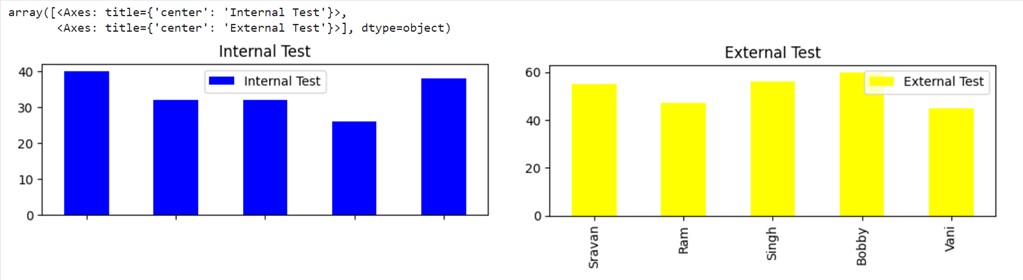
Example 5: Separate Plots
Utilize the same DataFrame as created under Example 3 and create separate Barplots by specifying the subplots parameter set to True. Separate Barplot for both columns in the pandas DataFrame.
# Create DataFrame with two columns
student_marks = pandas.DataFrame({‘Internal Test’:[40,32,32,26,38], ‘External Test’:[55,47,56,60,45]}
,index=[‘Sravan’,‘Ram’,‘Singh’,‘Bobby’,‘Vani’])
# Separate plots for two columns
student_marks.plot.bar(color={"Internal Test": "blue", "External Test": "yellow"},subplots=True)
Output
There are two columns in the DataFrame. So two subplots are created. The first subplot is blue in color as we set the color to “blue” and the second subplot is yellow in color as we set the color to this column as “yellow.”
2. pandas.DataFrame.plot.barh
We can create a Horizontal Bar Plot using the pandas.DataFrame.plot.barh function, and the syntax and the parameters are the same as pandas.DataFrame.plot.bar() function.
Syntax
pandas.DataFrame.plot.barh(x, y, other arguments)
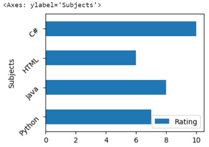
Example 1
Let’s create a DataFrame: subject_rating, with three columns – Category, Subjects and Rating. We will plot x = Subjects and y = Rating columns to a Horizontal Bar plot with bars as green color (color parameter is set to ‘green’) and the size of the bar plot as (4,3) by passing the figsize parameter.
# Create DataFrame with two columns
subject_rating = pandas.DataFrame({‘Category’:[‘Data’, ‘Programming’, ‘Web’,‘Programming’],
‘Subjects’:[‘Python’, ‘Java’, ‘HTML’,‘C#’],
‘Rating’:[7,8,6,10]})
# Plot Subjects and Rating to a Horizontal bar plot
subject_rating.plot.barh(x=‘Subjects’, y=‘Rating’,figsize=(4,3),color=‘green’)
Output
Example 2: Rotate by 45 degrees
Let’s create a DataFrame: subject_rating with two columns – Subjects and Rating. We will plot x = Subjects and y = Rating columns to a Horizontal Bar plot by rotating the x-axis to 45 degrees.
# Create DataFrame with two columns
subject_rating = pandas.DataFrame({‘Subjects’:[‘Python’, ‘Java’, ‘HTML’,‘C#’], ‘Rating’:[7,8,6,10]})
# Horizontal bar plot with rotation=45.
subject_rating.plot.barh(x=‘Subjects’, y=‘Rating’,figsize=(4,3),rot=45)
Output
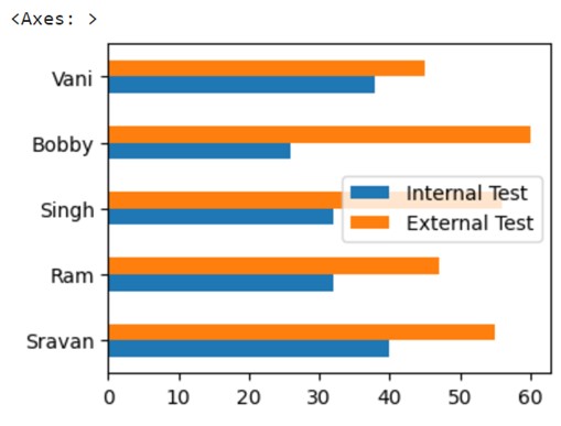
Example 3: Plot a Whole DataFrame to a Horizontal Bar Plot
Let’s create a DataFrame – student_marks with two columns: ‘Internal Test’ and ‘External Test’ with five values each. Indices of these five values will be [‘Sravan’, ‘Ram’, ‘Singh’, ‘Bobby’, ‘Vani’]. Plot the entire DataFrame without specifying x and y parameters.
# Create DataFrame with two columns
student_marks = pandas.DataFrame({‘Internal Test’:[40,32,32,26,38], ‘External Test’:[55,47,56,60,45]}
,index=[‘Sravan’,‘Ram’,‘Singh’,‘Bobby’,‘Vani’])
# Plot a whole dataframe to a Horizontal bar plot
student_marks.plot.barh(figsize=(4,3))
Output:
You can see that both columns are included in the Horizontal Bar plot with different colors by default.
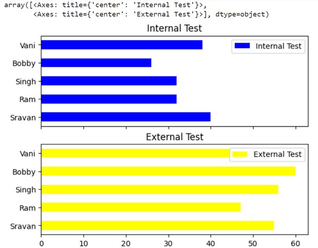
Example 4: Separate Plots
Utilize the same DataFrame as created under Example 3 and create separate bar plots by specifying the subplots parameter set to True. Separate Horizontal Barplots are created for both columns.
# Create DataFrame with two columns
student_marks = pandas.DataFrame({‘Internal Test’:[40,32,32,26,38], ‘External Test’:[55,47,56,60,45]}
,index=[‘Sravan’,‘Ram’,‘Singh’,‘Bobby’,‘Vani’])
# Separate Horizontal bar plots for two columns
student_marks.plot.barh(color={"Internal Test": "blue", "External Test": "yellow"},subplots=True)
Output
There are two columns in the DataFrame. So two horizontal subplots are created. The first subplot is blue in color as we set the color to “blue” and the second subplot is yellow in color as we set the color to this column as “yellow.”
Conclusion
We saw how to plot the DataFrame to horizontal and vertical Bar plots using the pandas.DataFrame.plot.barh and pandas.DataFrame.plot.bar functions. For each parameter, a separate example is discussed by specifying the outputs.
Source: linuxhint.com