Assigning Height to Breakpoints and Media Queries of Tailwind
Tailwind is a widely used CSS framework that provides predefined classes for designing layouts. To make the designs responsive, Tailwind provides various breakpoints and media query utility classes. Using these classes, the styling properties can adapt to the provided screen size in the breakpoints and make the design efficient and responsive.
This article will provide the procedure for assigning height to breakpoints and media queries in Tailwind using the following outline:
- What are the Various Breakpoints Used in Tailwind?
- How to Assign Height to Breakpoints and Media Queries in Tailwind?
What are the Various Breakpoints Used in Tailwind?
Tailwind provides four default breakpoints utility classes that are used for different screen sizes. These breakpoints are as follows:
- sm: This breakpoint refers to a small screen size that has a minimum width of 640px
- md: This breakpoint refers to a medium screen size that has a minimum width of 768px
- lg: This breakpoint refers to a large screen size that has a minimum width of 1024px.
- xl: This breakpoint refers to an extra-large screen size that has a minimum width of 1280px.
How to Assign Height to Breakpoints and Media Queries in Tailwind?
Tailwind provides a “h-{number}” class for assigning height to an element. To modify the height of an element according to the viewport size of the screen, this property can be used along the breakpoint and media query utilities. These utilities allow developers to provide styling to the elements according to the screen size or viewport dimension.
Syntax
The syntax for providing height to breakpoints utilities in Tailwind is stated as:
In the above syntax, the “screen size” refers to the breakpoint utility i.e., sm, md, lg, or xl.
Let’s understand the practical implementation of assigning heights to breakpoints in Tailwind using the below-demonstrated code:
The explanation of the above code is as follows:
- A “div” element is created using the “<div>” tag.
- The “h-20” class is used to provide the element a default height of px.
- The “bg-green-500” is responsible for the green background color of the element.
- The “rounded-xl” class is used for providing the extra large rounded corners to the element.
- The “w-20” class is used to provide the element with a fixed width of px.
- The “text-center” class places the text of the element in the center.
- The “sm:h-40” is a breakpoint class that will assign the element a height of px for a minimum screen size of px. Similarly, different heights are provided using the md, lg, and xl breakpoint utilities.
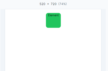
The output of the above-explained code is as follows. This time the element has a default height of “h-20” in px:
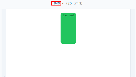
Now, as soon as the screen size reaches the 640px, the height increases to “h-60” in px:
Similarly, the height increases again when the “lg” breakpoint is reached:
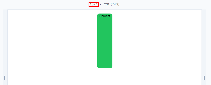
From the above demonstration, the effect of using breakpoints and media queries can be clearly understood.
That is all about assigning height to breakpoints and media queries in Tailwind.
Conclusion
Tailwind provides predefined breakpoints and media query utility classes for designing dynamic and responsive layouts. These classes include “sm”, “md”, “lg”, and “xl”. These breakpoints can be used along with the height property of the Tailwind to set height dynamically according to the screen size. The “height” property will be activated when the screen size reaches the minimum default width of the breakpoint screen sizes. This article has provided the procedure for assigning the height to breakpoints and media queries of Tailwind.
Source: linuxhint.com