CSS Hover Class
Purpose of the Hover Effect
In any document or browser, we use the links to websites for the assistance of the user. For this purpose, we can style the links for the pages that are not yet visited by using the link selector class. Similarly, for those links that are already visited, we use the visited selector. An active selector is used for the active links. These are all the link styles which show the effects on hover. If the link and the selector of the links that are visited are both present in the CSS definition, we use a hover selector class to see the resultant effect.
On the other hand, whenever we want to hover on any element in HTML, it causes some effects by using some properties in CSS, either on the existing content or on the new element form as a result of hover.
Syntax of the Hover Element
Content_of_HTML :hover{
// declare CSS code or effects you want to apply.
}
Example 1: Hover Changes the Color of the Text
This example deals with the transformation of the text when we move the cursor of the mouse towards it. We can apply the several conditions to the text. But for now, the two basic changes that follow are: the change in color of the text on which the hover is applied and the highlight of the text with a change in the background color.
Starting with the HTML head section, use the style tag inside it as we are doing an internal style. Use the style section inside the <head> tag. A hover class is used to apply all the effects on the text of the heading. So, h1 is used with the hover class.
Color: white;
Background-color: Purple;
}
The two properties, as we discussed earlier, are applied. By default, the color of the heading is black and the background color of the webpage is white. But on hover, the background color of that specified portion becomes purple, so the text color also changes into white.
HTML CSS code:
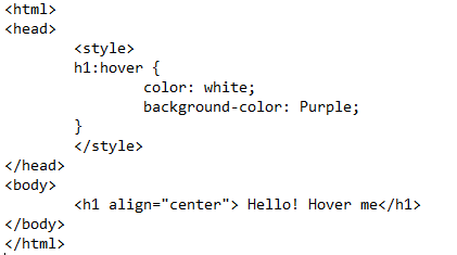
Close the style tag and the head section of HTML. Moving towards the body portion, a heading1 is declared. The alignment for the heading1 <h1> is set to center. Close all the tags and save the text editors file. To execute the output, we need to run the file in the browser. While saving the file, one thing should be kept in mind: save the file with the HTML extension instead of saving it with the text extension. Open with the default browser so you can get the output.
Output:
The output in the browser is captured in the form of a few-second video that leads to the excess in displaying the results. On the execution of the file, you will see that a simple heading in the center of the webpage appears. When we take the cursor close to the heading or hover over the heading, the background color and the font color is changed. Whenever the cursor is moved back, it comes back to default.
Example 2: Hover Builds a Block with Text
Unlike in the previous example where the existing text was changed on hover, in this example, a new content (block) of HTML is added that is shown only when we hover over the specified text. This block also have some dimensions and specifications. Let us elaborate on the procedure.
Starting with the CSS section, we tyle a div. This div creates a block of content that is the result of hovering over the text. The width and height are the two basic values applied to form any shape in HTML. Next is the padding property. It is the distance area of the content inside a block or a shape. For example, we have taken a text inside the block, so the distance of the text and the boundary of the shape is taken as the padding. If only the padding is used, then it means that it is the distance inside the box on every side. If the padding is done from a specified side, since we used the padding from the right, then it means that it is the distance on the right side. This property keeps the text inside the boundary of the block. Otherwise, there are chances of exceeding the text out of the border of the block.
Padding: 20px;
Padding-right: 50px;
This padding effect is applied to align the inner content with the outer content. The value is taken in pixels.
CSS code:
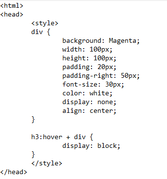
The font size and the font color of the text are applied to the text inside the block. The next style section is about the heading which we applied in the hover. As the content block is created inside the div, div is included in this type of styling together. The block shape content is created that is mentioned to form a display.
Display: block;
}
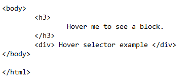
After that, close the style and head tags. Declare a heading inside the HTML body. A div is formed. The text that will be mentioned inside the block is also written inside the div tags. Close the body tag.
HTML Body Code:
Save the code in the file and run it in the browser. As an output of the previous code, we took a small portion of the video to elaborate on the working of the hover class that is created and designed to create a block with a text inside the block.
Output:
The video shows that a simple text as a heading is displayed when we run the file in the browser. But when we hover over the text, it causes a change on the web page. On hover, the text of the heading remains the same as it is at the time of execution. But a block on the left side of the page is created every time we move the cursor towards the heading. When we move the cursor away from the heading, the block vanishes. This is because the hover class creates a block and text inside it. All the effects on the block and text are applied in CSS.
Conclusion
CSS hover is a property that is used to prominent or highlight the HTML content when we move the cursor towards them. This function is mostly used to notify about something. In this article, we explained the working of a hover class, and how the HTML contents are transformed in hover. At the start, we gave a brief overview of the hover class. We implemented the two basic examples of the hover effect. The first example contains the effect on the existing text, whereas the second example is about showing an additional shape hovering towards the existing text while the existing text remains the same.
Source: linuxhint.com