3 Easy Ways to Place Images Side by Side in HTML & CSS
In this article, we will discuss how to place two divs side by side in CSS using:
Let’s get started!
Method 1: Place Two Divs Side by Side in CSS Using float
In CSS, the “float” property specifies the floating direction of an element. It places an element on the right or left side of the container, permitting the inline and text elements to wrap around it.
Syntax
The syntax of the float property is:
Here is the description related to the above-mentioned value of the float property:
- none: It is used for no floating.
- left: It is used to float elements on the left side.
- right: It is used to float elements on the right side.
Using the “float” property, you can also place images side by side. Let’s move to the example of placing images side by side.
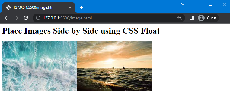
Example 1: Placing Two Images Side by Side Using float Property
Here, we have added a heading using <h1> and created two divs, and assigned the image sources to it.
HTML
In CSS, we will use “.div” to access both divs that we have created in the HTML file. Next, assign the value of the float property as “left”. As a result, the effect will be applied to both of our containers.
CSS
float: left;
}
As you can see, we have successfully placed images side by side:
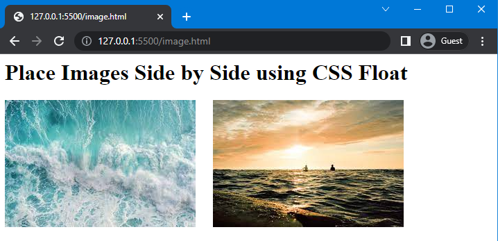
Example: Place Two Images Side by Side With Space
If you want to create space between these two images and place them side by side, then use the “width” property and assign a value to it.
Here, we will assign the value of the width property as “300px”:
float: left;
width: 300px;
}
Save the given code and check out the results:
Method 2: Place Images Side by Side in CSS Using grid
To place two or more than two images side by side the “grid” layout is used. Basically, the grid is a value of the display property used to create a layout consisting of rows and columns.
Syntax
Syntax of the display property with grid layout is given as follows:
Let’s move to the example.
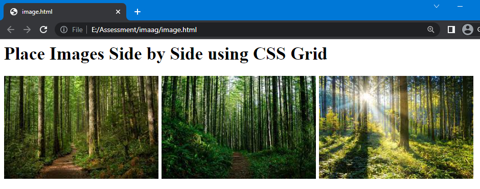
Example
Here, we will create four sub divs inside the main div names as “parent” and add images to it using <img> tag.
HTML
Next, in the CSS section, we will use the “.parent” to access the parent div and set the value of the display property as “grid”. After that, we will set the fraction using the “grid-template-columns” property to create space for columns. Specifying “1fr” three times will create “three” columns, which means all divs have equal space. Furthermore, we will set the gap between columns using the column-gap property and set its value as “5px”:
display: grid;
grid-template-columns: 1fr 1fr 1fr;
column-gap: 5px;
}
Once your complete the CSS code, execute the HTML file and check the output:
Method 3: Place Two Images Side by Side in CSS Using flex
The “flex” is the value of the display property that allows placing elements side by side. In such a scenario, elements will be set according to the viewport of the display screen.
Syntax
The syntax of display property with flex is:
Let’s move to the example:
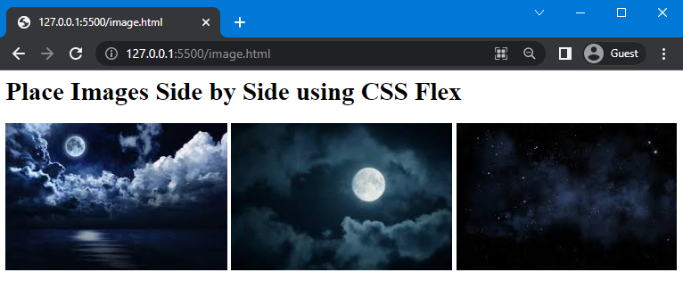
Example
We will consider the previous HTML file and add three sub divs inside the main div and specify different images sources to it:
In CSS, set the value of the display property as “flex” and set column-gap as “5px”:
display:flex;
gap: 5px;
}
This will give the following result:
We have provided three simple ways for placing images side by side in HTML and CSS.
Conclusion
Images are placed side by side by using three different methods of CSS, which are the “flex” and “grid” values of the display property and the “float” property. CSS also permits you to place the space or gap between these adjacent images. In this guide, we have discussed these three methods in detail and provided examples of each method to place images side by side using CSS.
Source: linuxhint.com